
Report Publication
Blog Post
Social Posts
Landing Page
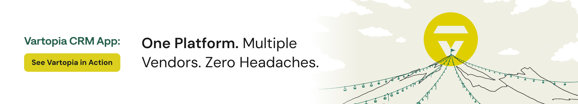
This landing page was designed to bring Vartopia’s brand to life while making complex information easy to absorb. Using the brand’s core green palette and a hiking-inspired exploration motif, I created a visual journey that guides users naturally through the content.
The layout is split into clear, scannable sections using color breaks and icons to reduce text heaviness and improve readability. The focus was on keeping the experience clean, engaging, and easy to follow, encouraging users to stay on the page while quickly understanding the product’s value.
The final design balances fresh visuals with clarity and structure, turning a feature-rich product into an approachable, conversion-focused landing page.
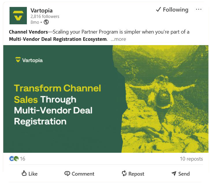
Social Posts
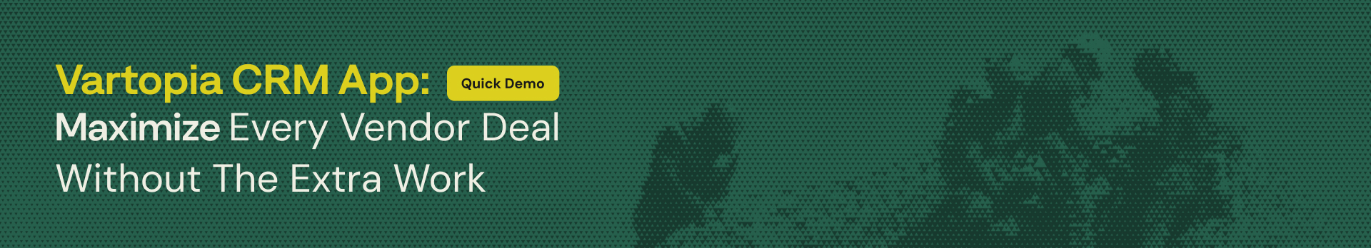
Alongside the landing page, I designed a series of LinkedIn social posts to support campaign visibility and drive clicks. The client requested content optimized for LinkedIn, with a focus on stopping the scroll and maintaining strong brand recognition.
I delivered both static and animated GIF versions to create more dynamic, eye-catching posts. Animation was used intentionally to highlight key messages without overwhelming the viewer. Strict brand guidelines were followed throughout, using the same green color palette and continuing the outdoor, nature, and hiking imagery to keep the visuals consistent across platforms.
The result is a cohesive set of social assets that feel on-brand, engaging, and tailored to LinkedIn’s fast-moving feed.
LinkedIn example


Promo Ad Video for Vartopia Hub
For Vartopia, I produced an ad promo video designed to be punchy, emotional, and credible. The goal was to connect with viewers while highlighting client success to build trust. I used simple, clean typography that reinforces key messages without distracting from the visuals, keeping the focus on statistics and storytelling. Throughout the video, every element, from video footage to icons, is aligned with Vartopia’s brand identity, ensuring a cohesive and compelling narrative that resonates with the audience and brings trust to the product (Vartopia Hub).
Case Study Report
The Vartopia case study report was designed to transform dense, feature-rich content into an engaging, easy-to-read document. To prevent information overload, I structured the report with clear sections, breaking large blocks of text into digestible chunks that guide the reader through the narrative naturally.
I incorporated visual cues, icons, and illustrative elements to highlight key points and create a balance between text and imagery. This approach keeps the document visually dynamic while ensuring that the information remains clear and approachable. Thoughtful layouts and hierarchy were used to draw attention to the most important insights, making complex content feel accessible without sacrificing detail.
Below are a few highlights from the case study, showcasing the layout and visual design.


Blog Posts
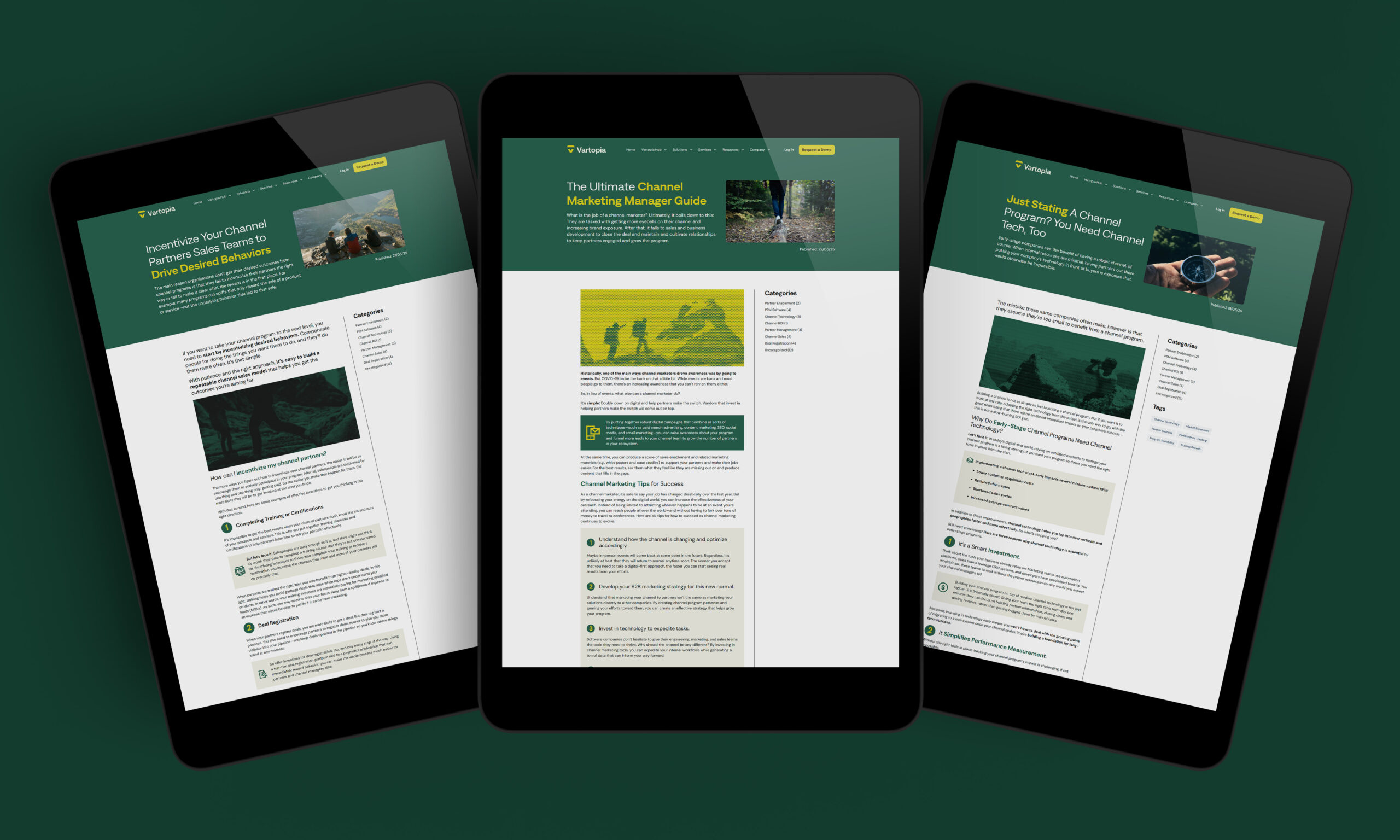
I designed a set of 24 blog posts for Vartopia, carrying the same brand identity and visual language across all pieces. Each post was crafted to balance text and visuals, using color, typography, and icons to maintain readability and keep the content engaging. The consistent design ensures the posts feel cohesive while highlighting key messages and supporting the brand’s overall look and feel.
Here are three examples from the full set of 24 blog posts:
Example blog 1
Example blog 2
Example blog 3
Here are three examples from the full set of 24 blog posts:
Example blog 1
Example blog 2
Example blog 3