Brand Identity
Print Design
Web Design
Taste Legend
I set out to create a cohesive visual identity that reflects the restaurant’s authentic Chinese cuisine and family heritage. With a focus on their hand-pulled noodles, a point of pride for the client. I developed a modern logo, user-friendly website, a refined print menu, and supporting assets that balanced tradition with a contemporary feel.
The new identity moves away from the previous logo, introducing a clean, distinctive design that subtly captures the craft, care, and character behind the food while meeting the client’s strict criteria.
The new identity moves away from the previous logo, introducing a clean, distinctive design that subtly captures the craft, care, and character behind the food while meeting the client’s strict criteria.


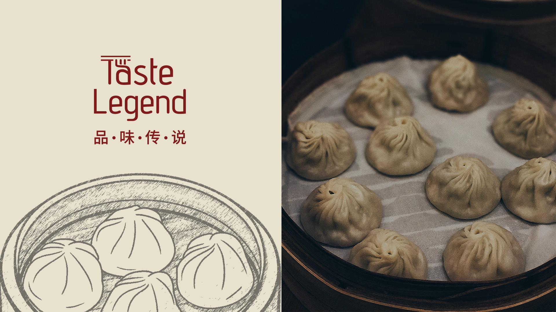
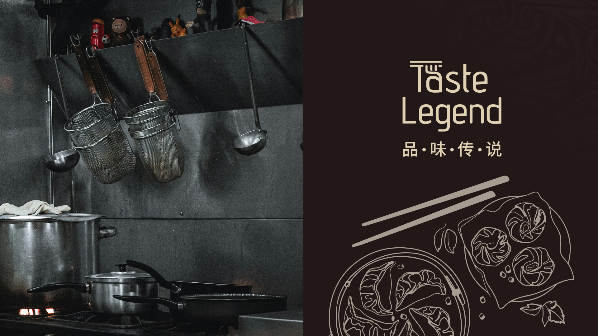
Previous Iterations
The four main iterations presented here are from working with the client to figure out what they wanted to show. Each concept highlighted a different element of their restaurant, using distinct visual styles and typefaces to test how tone, hierarchy, and personality could shift perception.
Typography was treated as a problem-solving tool rather than decoration. Each font supported a specific concept, from warmth and approachability to craft, quality, or modern efficiency. Exploring multiple typographic directions helped determine which visual language best aligned with the client’s goals and target audience.
Ultimately, the client selected the middle logo, as it achieved a strong balance between abstraction and a clear, understated representation of Taste Legend’s identity.
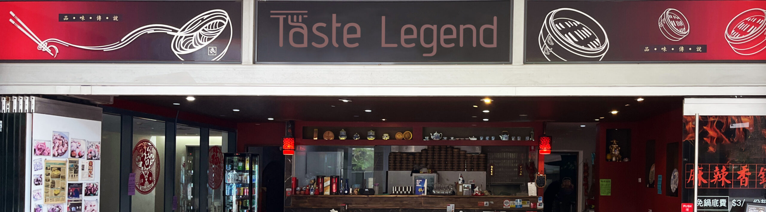
Restaurant Decor
I recommended aligning the new brand identity and color palette for Taste Legend with the restaurant’s interior decor. By incorporating similar tones of red, beige, and black, I created a cohesive visual experience that mirrors the ambiance of the restaurant. This approach helps the branding feel more unified.


Menu Design
A key deliverable was the takeaway menu, with strict client requirements that all items fit within a double-sided A4 brochure. Although this was the most challenging aspect, it was a strict requirement since the extensive offering was a major part of its appeal.
To help with legibility, I introduced a clear typographic hierarchy, structured layouts, and supporting icons to help customers scan the menu efficiently despite the high volume of items.
To help with legibility, I introduced a clear typographic hierarchy, structured layouts, and supporting icons to help customers scan the menu efficiently despite the high volume of items.
Supporting Assets
I extended the visual identity across supporting assets, including business cards, takeaway packaging, and staff aprons. Each piece was designed to balance a modern aesthetic with an authentic, traditional feel. Hand-drawn elements were paired with fluid digital illustrations to create a visual language that feels crafted yet contemporary. The organic line work adds warmth and personality, while the clean digital execution ensures consistency and modern appeal, reinforcing the restaurant’s heritage while connecting with a contemporary audience.


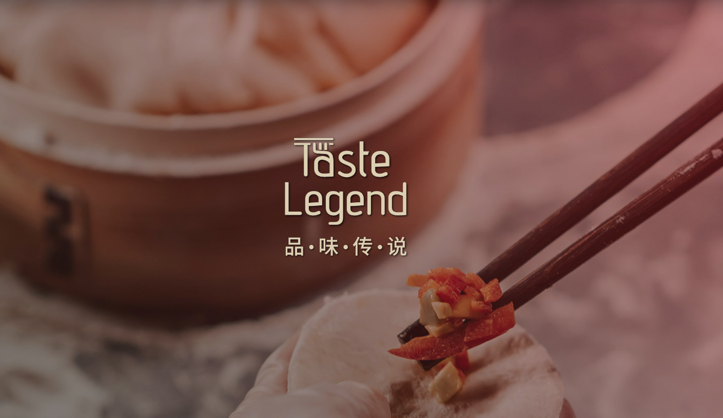
Website
One of the key deliverables was the website, which the client had long wanted. The website’s purpose is to share their story and serve as a hub for customers to access the menu, location, contact information, and operating hours. The design is modern yet stays true to Chinese aesthetics, incorporating real photos of the restaurant in action to create an authentic and cohesive online presence.
Link to live website: Taste Legend
Link to live website: Taste Legend

Supporting Illustrations
In addition to the logo redesign, I suggested that the client should consider supporting assets to maintain a consistent style across their media. A clean line drawing style complemented their homey and personal aesthetic, so I created simple illustrations for both digital and print deliverables.

Social Identity
The social identity uses a bold red-to-dark gradient to reflect warmth, tradition, and intensity. Paired with dynamic in-action shots and rich food photography, the visuals highlight movement, craftsmanship, and crave-worthy detail. The result is a striking, energetic feed that feels authentic, modern, and deeply rooted in Chinese culinary culture.

Visual Direction & Moodboard
This moodboard defines the overall look and feel of the brand moving forward. It brings together key visual references — including the logo, imagery, colour, and graphic elements — to communicate the intended tone, atmosphere, and design direction. The purpose of this board is to align expectations and provide a clear visual foundation for all future applications, ensuring consistency while balancing modern design with authentic cultural character.