
Brand Identity
Social Media
Print Design
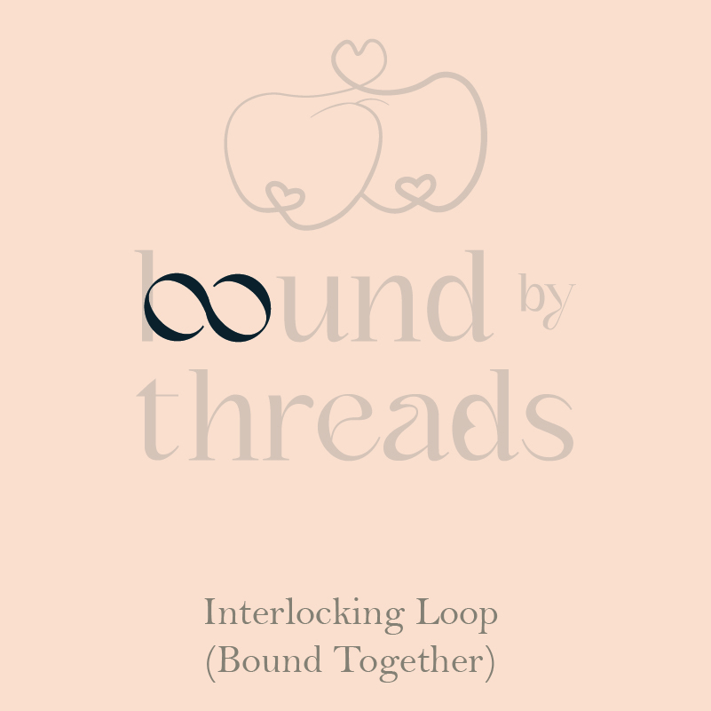
bound by threads
For bound by threads, I worked on creating a brand identity that felt sweet and nostalgic, centered around the client’s cherished childhood memory of apples. This inspiration led to the tagline “Stitched with Sweetness, Bound to Belong,” which captures the brand’s mix of personal connection and warmth.
The client loved apples since childhood, often associating them with fond memories of carefree days and simple joys. This little detail became our inspiration to weave an apple motif into the design, a touch of whimsy that reflects her personal story and invites customers into a space of comfort and familiarity. From the logo to subtle apple accents in the packaging, each element brings that playful, heartfelt vibe to life.
With this project, I crafted visuals and branding that feel like a memory itself, appealing to customers looking for a brand with a story worth sharing.


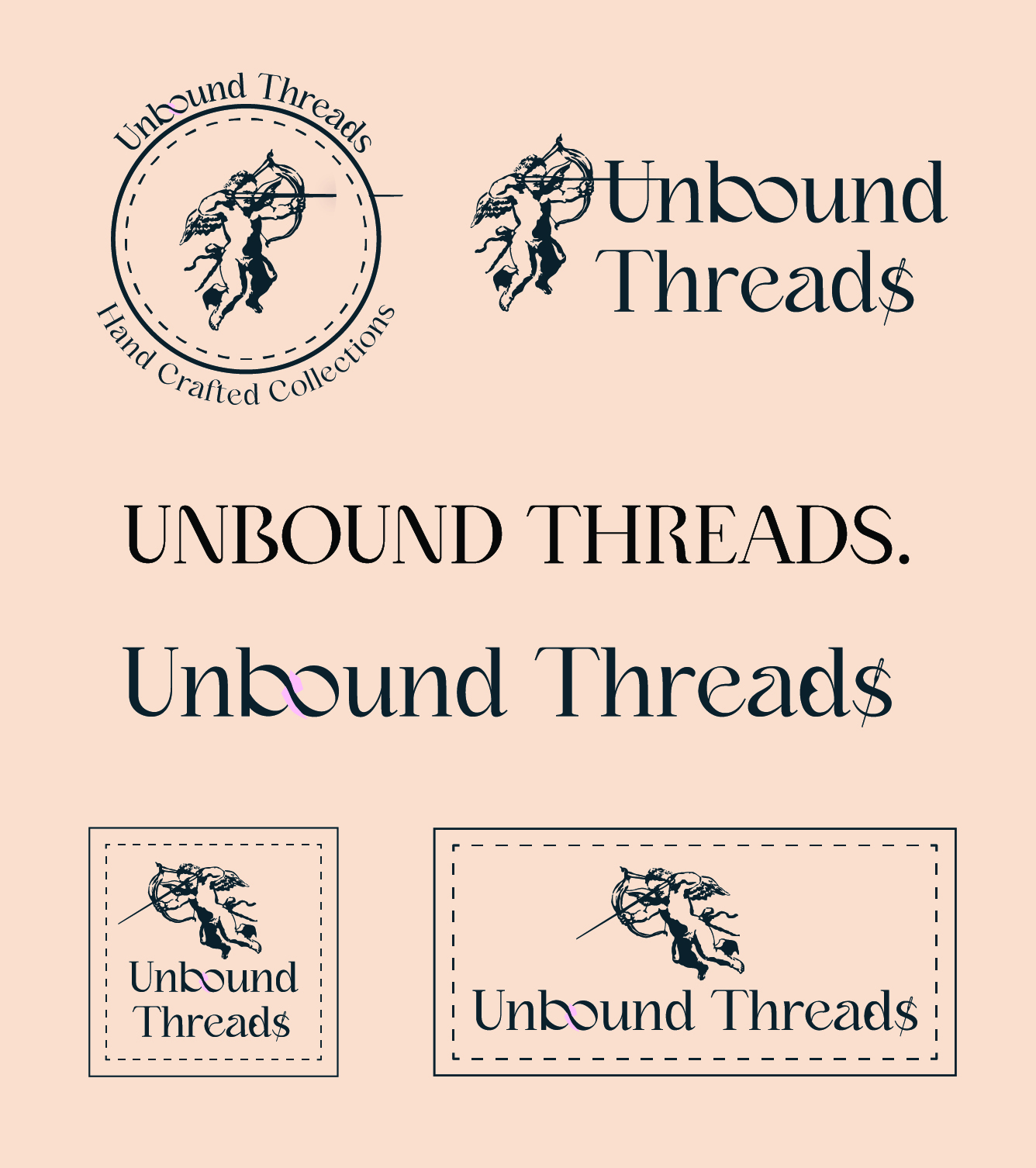
Previous Iterations
An earlier iteration explored a more serious, high-end direction, drawing from traditional aesthetics to position the brand as refined and timeless. This concept featured an illustrated cupid holding a bow and needle, symbolising craftsmanship and the idea of being bound through stitching rather than an arrow.
After presenting both concepts and discussing the brand’s backstory and desired tone in more depth, it became clear that this direction felt too formal for the client’s personal brand. They resonated more strongly with a softer, cuter visual style and the apple motif, which better expressed the warmth, creativity, and sense of connection behind “bound by threads”. The final direction reflects this shift, emphasising approachability while still honoring the idea of being bound together through handmade work.
After presenting both concepts and discussing the brand’s backstory and desired tone in more depth, it became clear that this direction felt too formal for the client’s personal brand. They resonated more strongly with a softer, cuter visual style and the apple motif, which better expressed the warmth, creativity, and sense of connection behind “bound by threads”. The final direction reflects this shift, emphasising approachability while still honoring the idea of being bound together through handmade work.


Business Cards
Designed with elegant serif fonts and a subtle embossed effect, these business cards bring a tactile, refined touch to the brand. Inspired by the warmth and nostalgia of apples, the design reflects the brand’s sweet, heartfelt personality in a simple, memorable format.
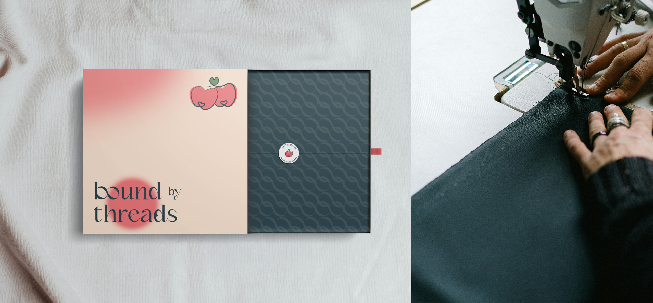
Visual Identity
Developed a cohesive visual identity showcasing how the brand can be applied across print, packaging labels, and other touchpoints. The designs carry the brand’s nostalgic, handmade, and heartfelt personality while maintaining consistency and versatility.


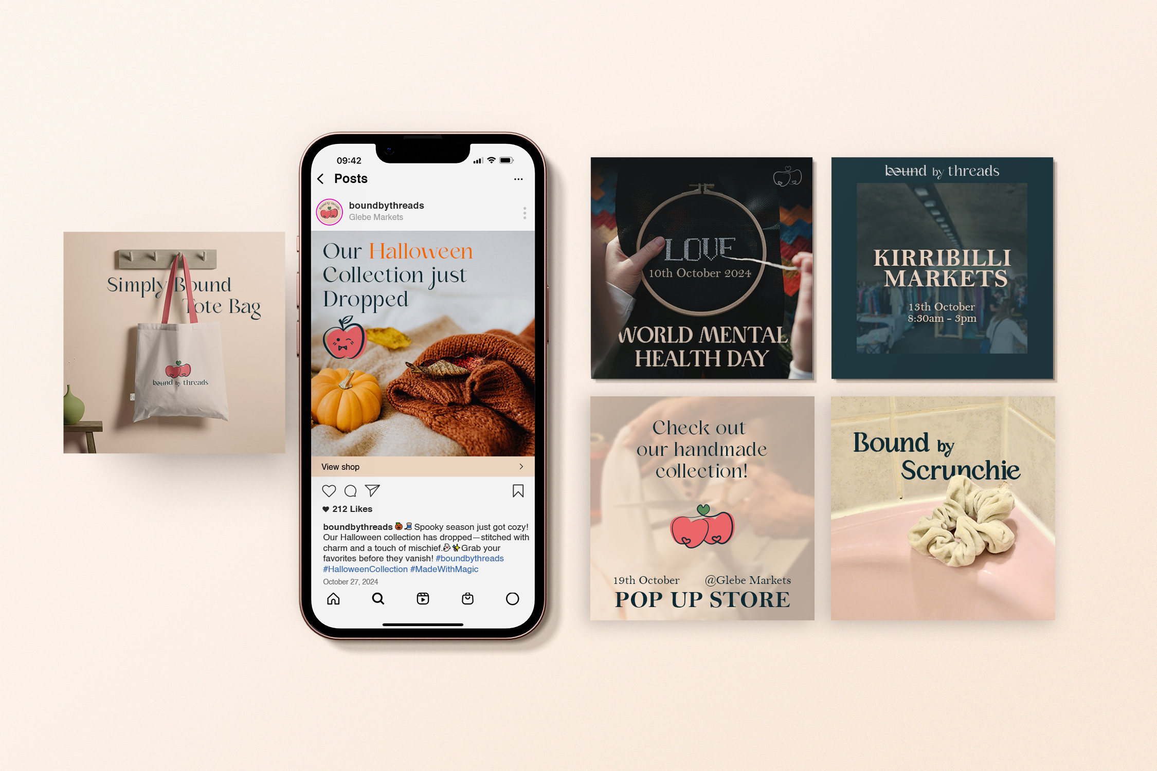
Social Identity
Created a cohesive Instagram presence with posts and stories that reflect the brand’s handmade, warm, and nostalgic vibe. Using a consistent color palette and playful, heartfelt visuals, the account brings the brand to life online while maintaining the sweet, personal feel of the overall identity.