Campaign
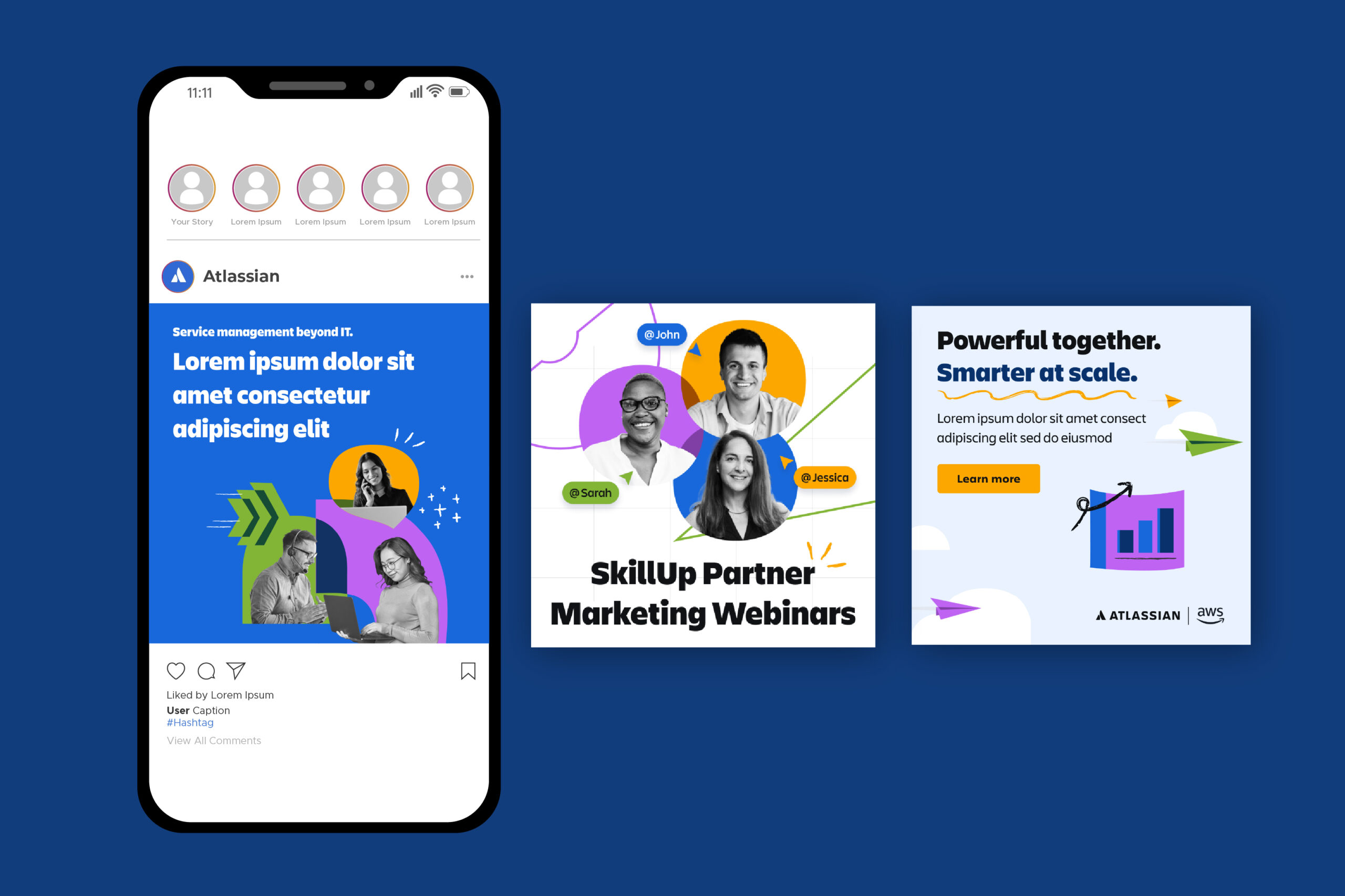
Social Media
Brand Marketing
Landing Page
This campaign involved designing a co-branded landing page for Atlassian in partnership with AWS, following Atlassian’s strict brand guidelines and established visual identity. The design uses Atlassian’s humanistic shapes, playful layouts, and bold colour application, alongside black-and-white collage-style imagery for human elements to maintain consistency with the brand while keeping the page approachable and engaging.
The landing page was designed to support a clear conversion goal, encouraging users to download a free datasheet. Happy, people-focused imagery centred on teamwork and success was used throughout to reinforce Atlassian’s collaborative values and create a positive tone.
The landing page was designed to support a clear conversion goal, encouraging users to download a free datasheet. Happy, people-focused imagery centred on teamwork and success was used throughout to reinforce Atlassian’s collaborative values and create a positive tone.
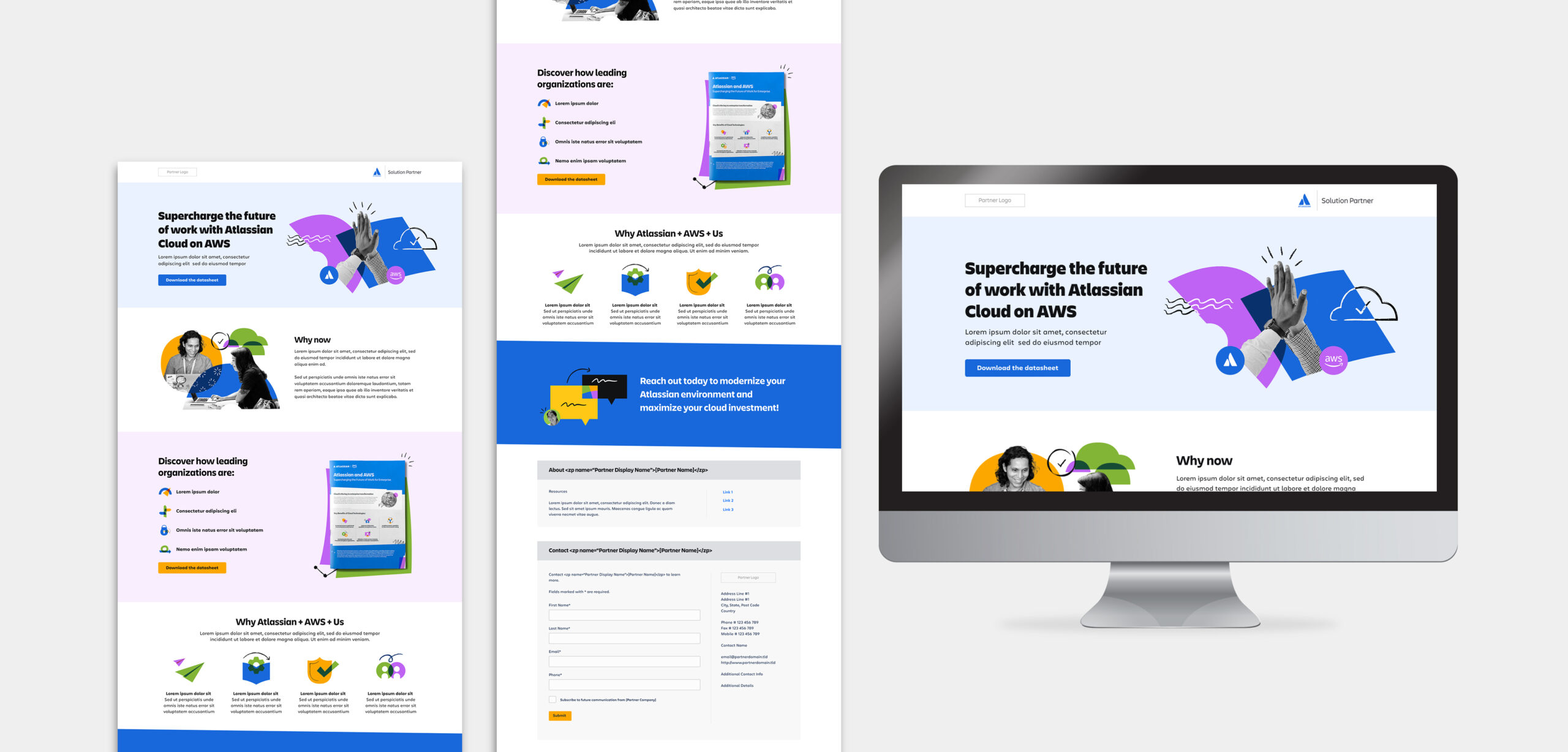
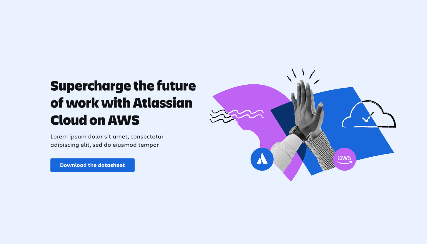
A key focus of the design was simplifying complex technical information into clear, easy-to-digest content. Structured layouts, custom iconography, and strong visual hierarchy were used to guide users through the page. Icons help divide sections and support quick scanning, while colour-blocked backgrounds break up content and give the eye space to rest, preventing the page from feeling text-heavy and improving overall readability.
All copy has been scrambled, modified, or replaced with placeholder text for confidentiality. This work is shown to highlight the visual design, layout decisions, and overall design approach.
All copy has been scrambled, modified, or replaced with placeholder text for confidentiality. This work is shown to highlight the visual design, layout decisions, and overall design approach.
Emails
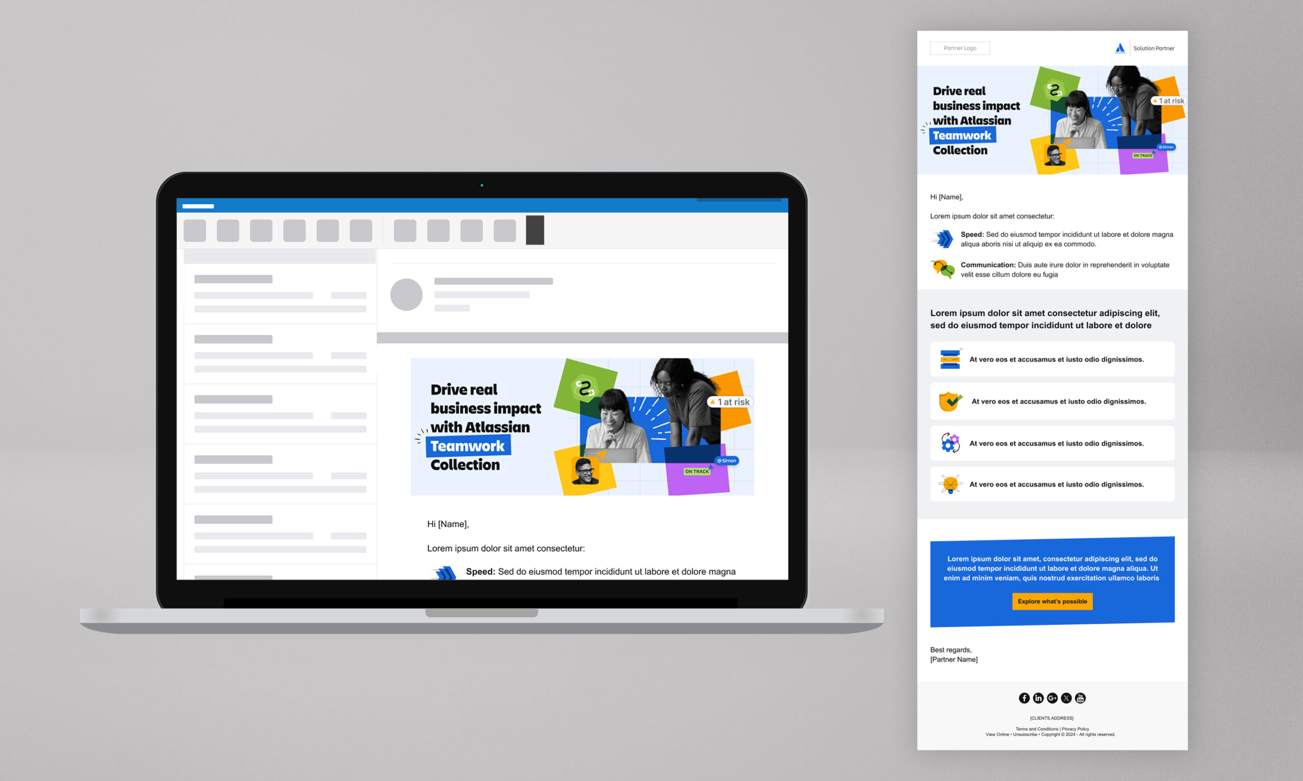
As part of the campaign, a series of marketing emails was designed to align closely with the landing page and broader Atlassian brand system. The emails follow Atlassian’s visual identity, incorporating humanistic shapes, playful layouts, and bold colour usage, alongside black-and-white collage-style imagery to maintain consistency across touchpoints.
Videos and Motion
Supporting video assets were produced as part of the campaign, following Atlassian’s brand guidelines and established visual style. The videos carry through the same visual language as the landing page and email designs, using humanistic shapes, playful layouts, bold colour, and black-and-white collage-style imagery to maintain consistency across motion and static touchpoints.
The animation style incorporates drawn-on elements, subtle wiggle movements, and restrained transitions to keep the visuals feeling dynamic and engaging. Layered sound design, including paper textures, typing sounds, and soft interface-style effects, adds a tactile quality that complements the motion without distracting from the content. Together, these elements help communicate complex ideas in a way that feels approachable, human, and aligned with Atlassian’s brand system.
All copy has been replaced with placeholder text or blocked for confidentiality. Voice overs were removed and music was replaced. This work is shown to highlight the motion design and
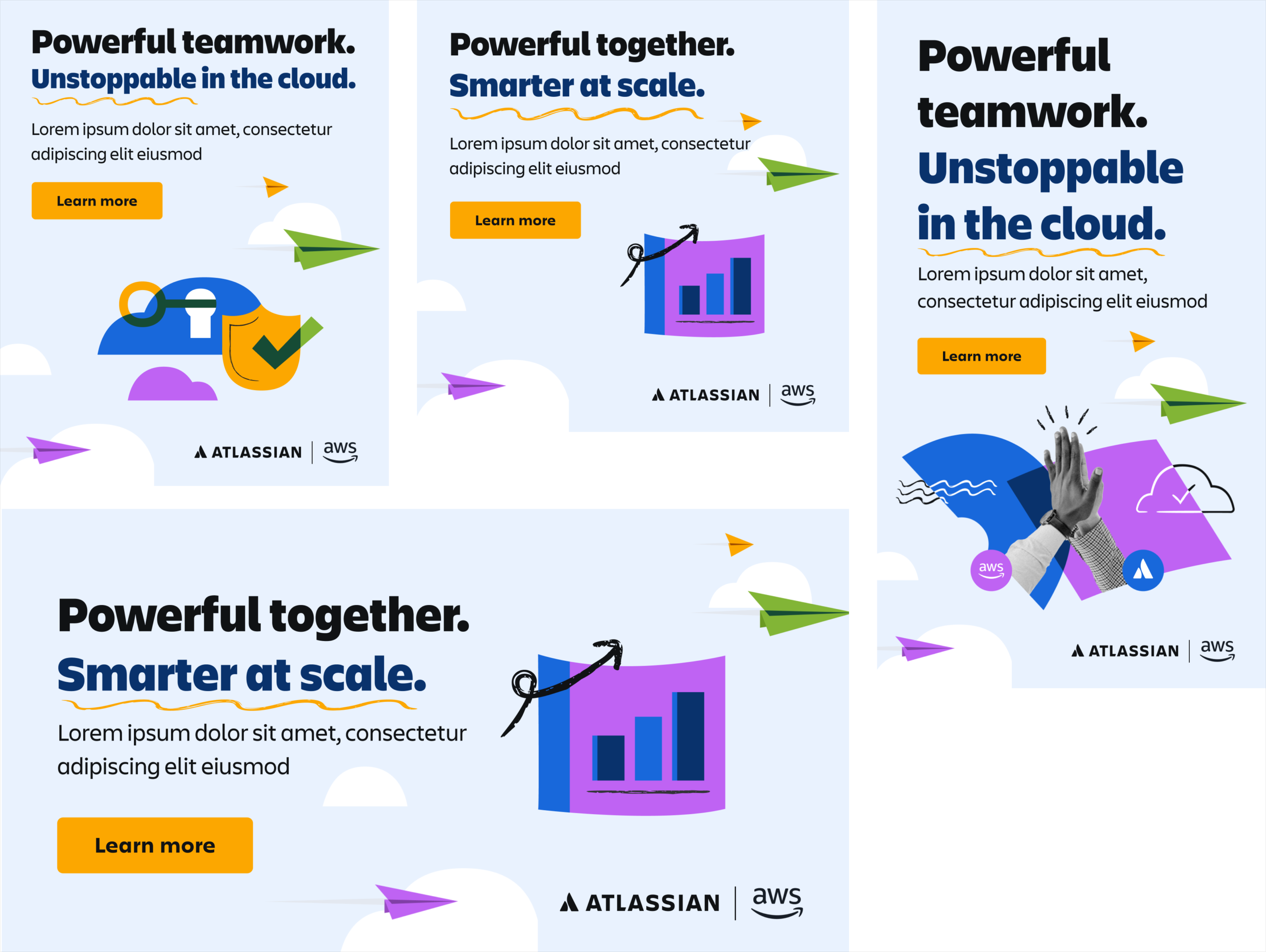
Ad Banners
A set of digital ad banners was designed to support the campaign across paid and partner channels, driving traffic to the landing page and reinforcing the overall campaign message. The banners follow Atlassian’s visual identity and brand guidelines, carrying through the same layouts, colour usage, and playful graphic elements to ensure consistency and strong brand recognition at smaller scales.


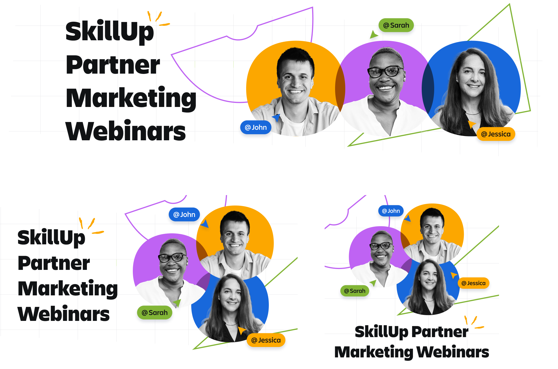
Social Tiles
A range of digital ad banners and social media tiles was designed to demonstrate how Atlassian’s visual identity adapts across multiple platforms and formats, including Facebook, LinkedIn, and Instagram. Each asset was carefully scaled and reformatted to suit different aspect ratios and placements, ensuring clarity, legibility, and visual impact regardless of size.