Print Assets
Motion Design
Digital Assets
Showreel
I created a showreel for Exclusive Networks that showcases the breadth of design work produced for the brand across multiple asset types. While it functions as an introduction to their visual output, it also serves as a compilation showreel of all the design work I have created for Exclusive Networks, bringing everything together into a single, cohesive piece.
The showreel follows the brand’s evolving visual identity, using their gradient colour palette alongside the new glassmorphism style being introduced into the brand guidelines. Through motion, layering, and transparency, the reel adds depth and energy while reinforcing Exclusive Networks’ focus on emotion and movement, creating a polished and contemporary opening to the project.
The showreel follows the brand’s evolving visual identity, using their gradient colour palette alongside the new glassmorphism style being introduced into the brand guidelines. Through motion, layering, and transparency, the reel adds depth and energy while reinforcing Exclusive Networks’ focus on emotion and movement, creating a polished and contemporary opening to the project.
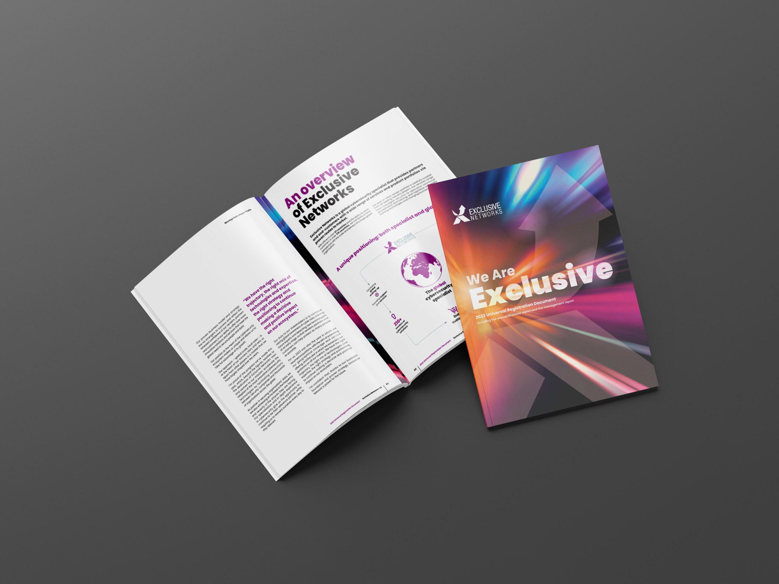
Report
Exclusive Networks’ brand identity is built around abstract imagery, gradients, and expressive visuals that communicate emotion and movement rather than literal representation. For this project, I designed a series of print reports and case studies, using the flexibility of their visual identity to explore creative layouts while staying aligned with the brand. The goal was to present complex information in a way that felt engaging, modern, and easy to navigate.
The content consisted of large volumes of text that needed to be translated into a clear visual narrative. I focused on breaking up dense information through structured sections, strong typographic hierarchy, icons, infographics, and supporting visuals. This approach helped transform long-form written content into digestible, reader-friendly print assets while maintaining clarity, consistency, and visual impact.
The content consisted of large volumes of text that needed to be translated into a clear visual narrative. I focused on breaking up dense information through structured sections, strong typographic hierarchy, icons, infographics, and supporting visuals. This approach helped transform long-form written content into digestible, reader-friendly print assets while maintaining clarity, consistency, and visual impact.
*Click arrows or page to flip through.
Note this is a heavily cut down version of the full report.
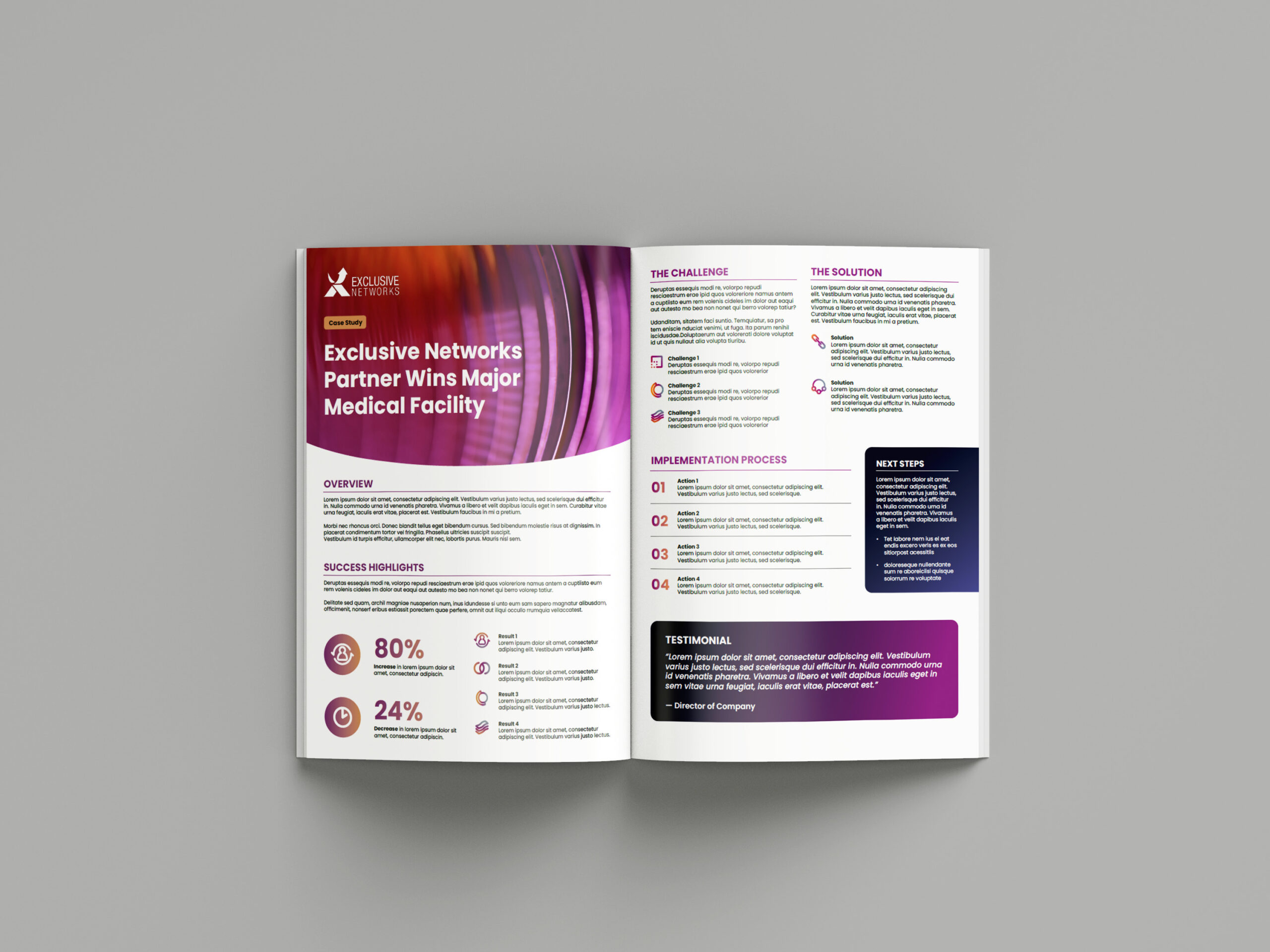
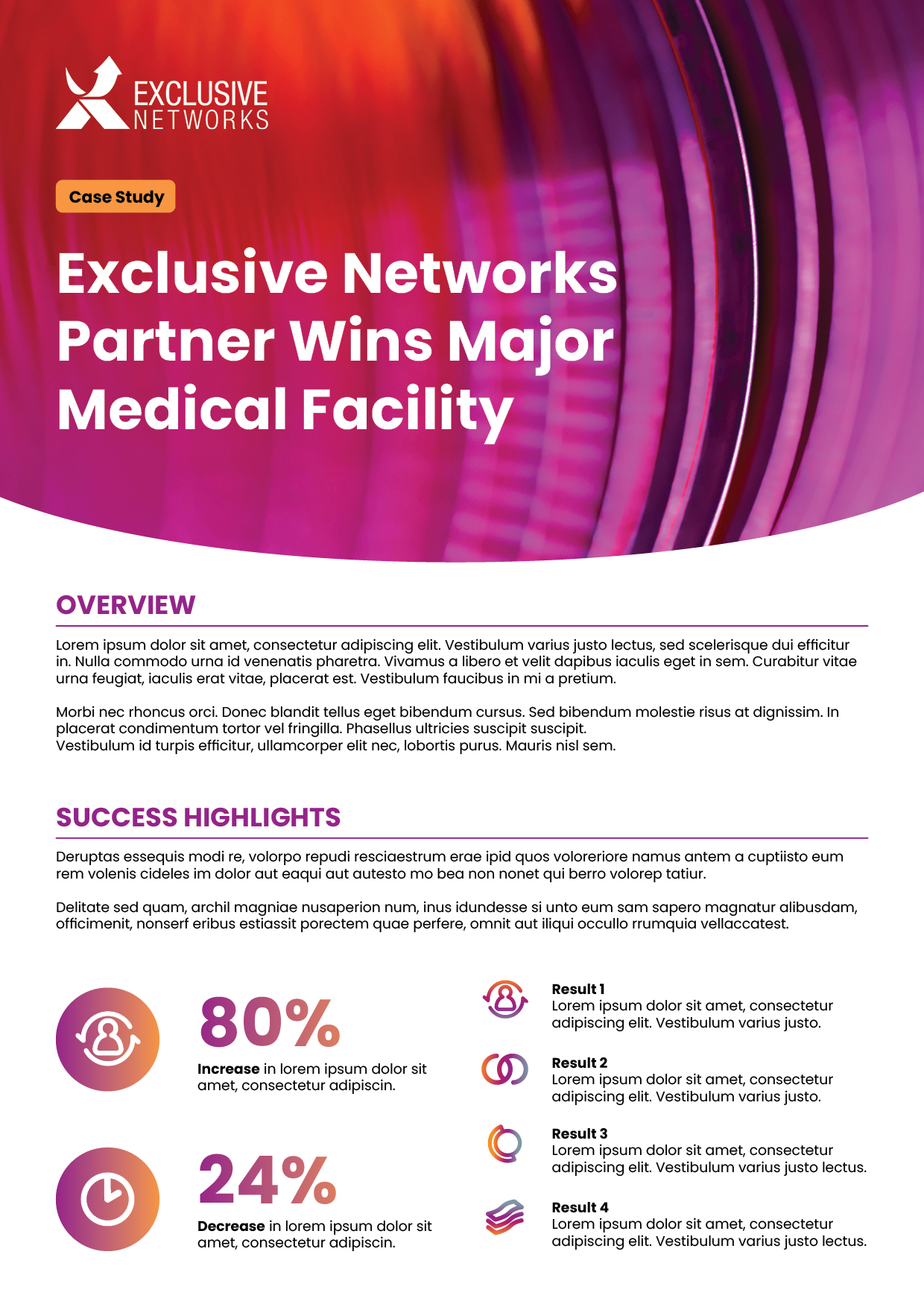
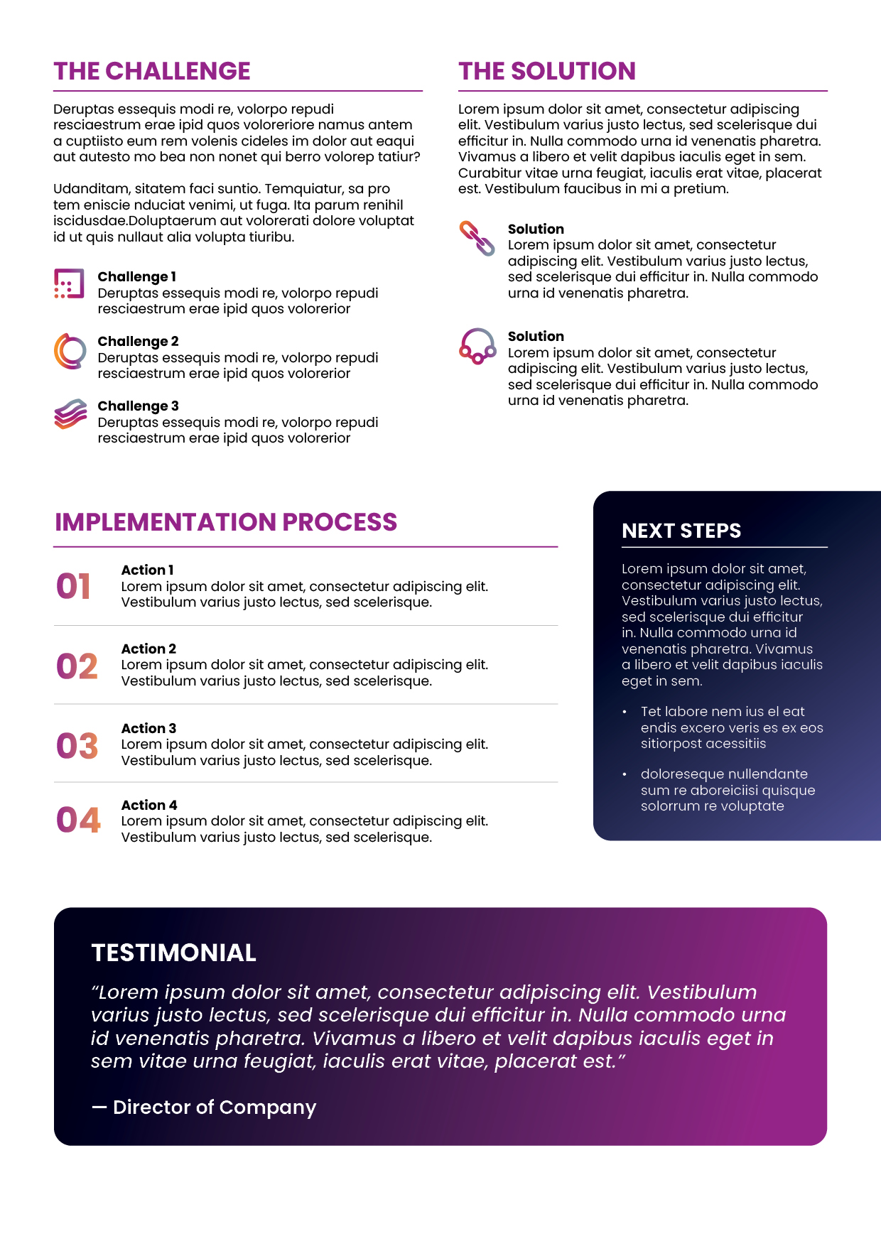
Case Studies
I designed three distinct case study layouts for Exclusive Networks, each tailored to different content types while remaining cohesive within the brand’s abstract and expressive visual identity. Using gradients, flexible layouts, and non-literal imagery, each design explored a different visual approach while maintaining consistency through typography, colour, and structure.
The case studies were built to clearly communicate key insights, challenges, and outcomes without overwhelming the reader. I focused on strong information hierarchy, modular sections, and visual cues such as icons and infographics to guide the flow of content. This allowed each case study to feel visually unique while remaining easy to read and aligned with Exclusive Networks’ brand language.
*All content has been replaced with placeholders due to internal information


Example Campaign
This is an example of a campaign which was built around a game-inspired concept where participants accept and complete “quests” to earn multiplied rewards based on performance. The aim was to create an engaging, motivational system that felt playful and rewarding, while still aligning with Exclusive Networks’ abstract brand language. Although the campaign intentionally moved away from their typical brand executions, it retained core elements such as abstract visuals, gradient use, and the primary colour palette of purple, pink, orange, and green.
To support the gaming theme, I introduced a gem motif, commonly associated with achievement, progression, and collectables in games. This visual device became a unifying element across all assets, helping the campaign feel cohesive while clearly communicating value, progression, and reward.
*Audio is removed and content has been replaced with placeholders due to internal information.
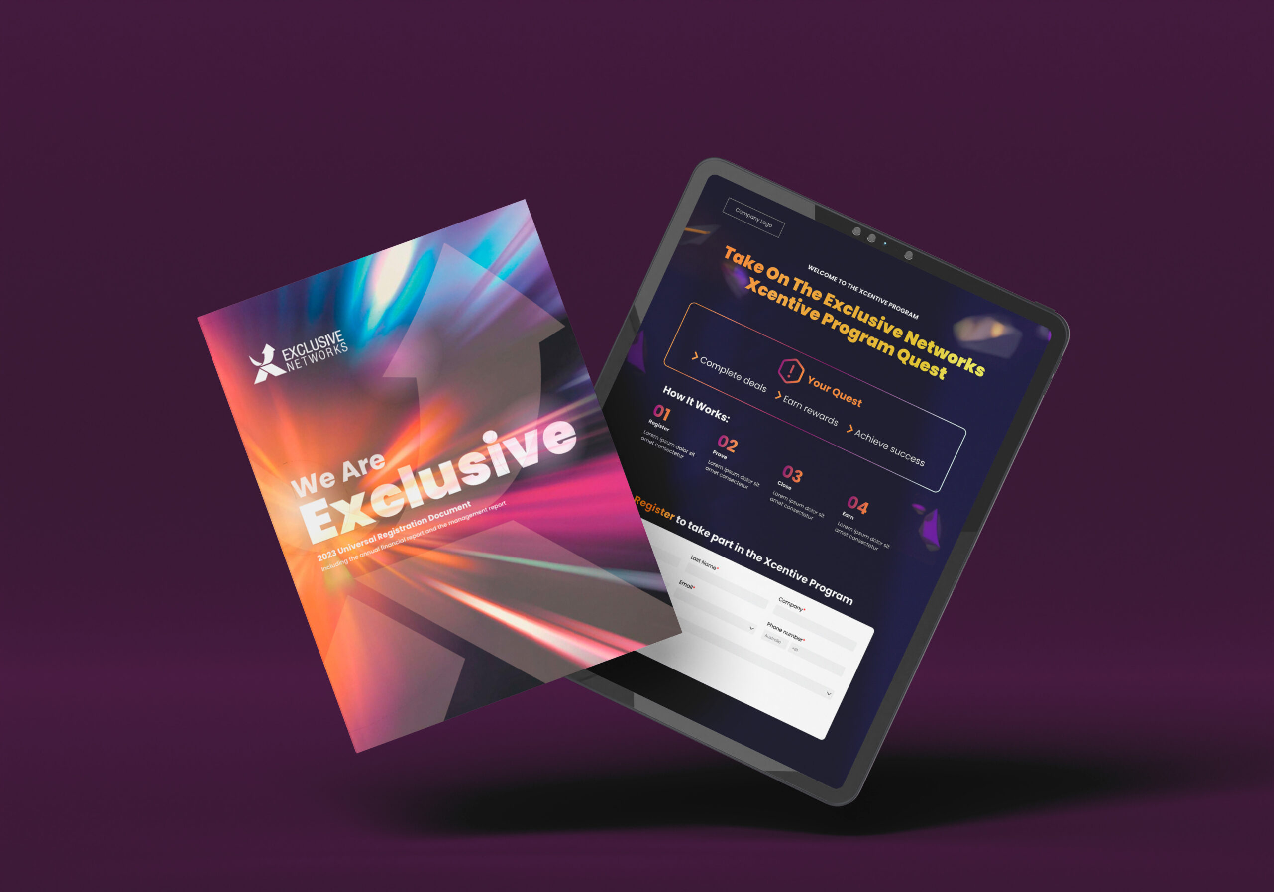
Landing Page
The landing page acted as the central hub for the campaign, introducing the concept, explaining the rewards structure, and encouraging sign-ups. I focused on clear information hierarchy and modular sections to guide users through the program, combining abstract visuals, gradients, and gem elements to create an immersive and energetic experience. The design balanced engagement with clarity, ensuring the mechanics of the program were easy to understand at a glance.
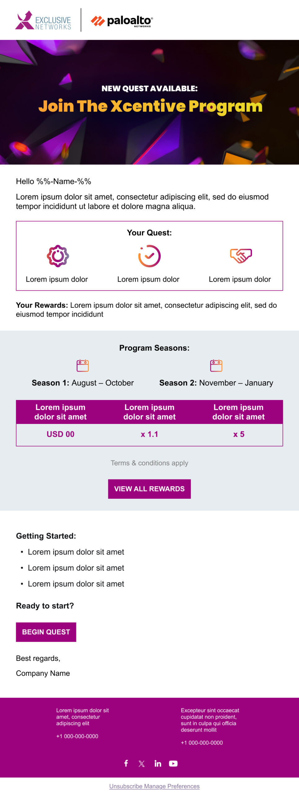
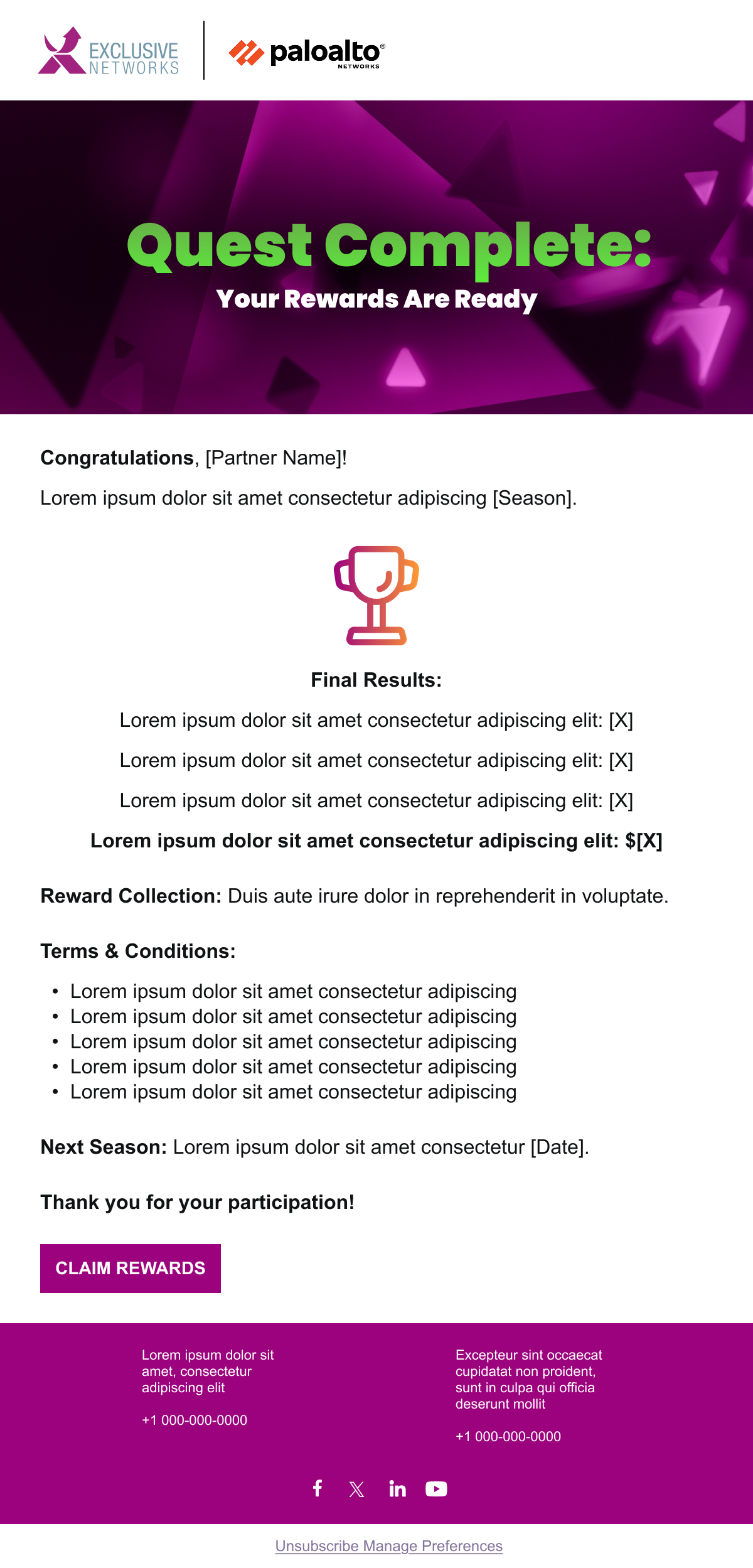
Email Design
The email assets were created to drive participation and maintain momentum throughout the campaign. I designed them to be visually impactful while remaining concise, using strong headings, iconography, and gem visuals to highlight key actions and rewards. Each email reinforced the game-like structure and encouraged users to continue progressing through the program.
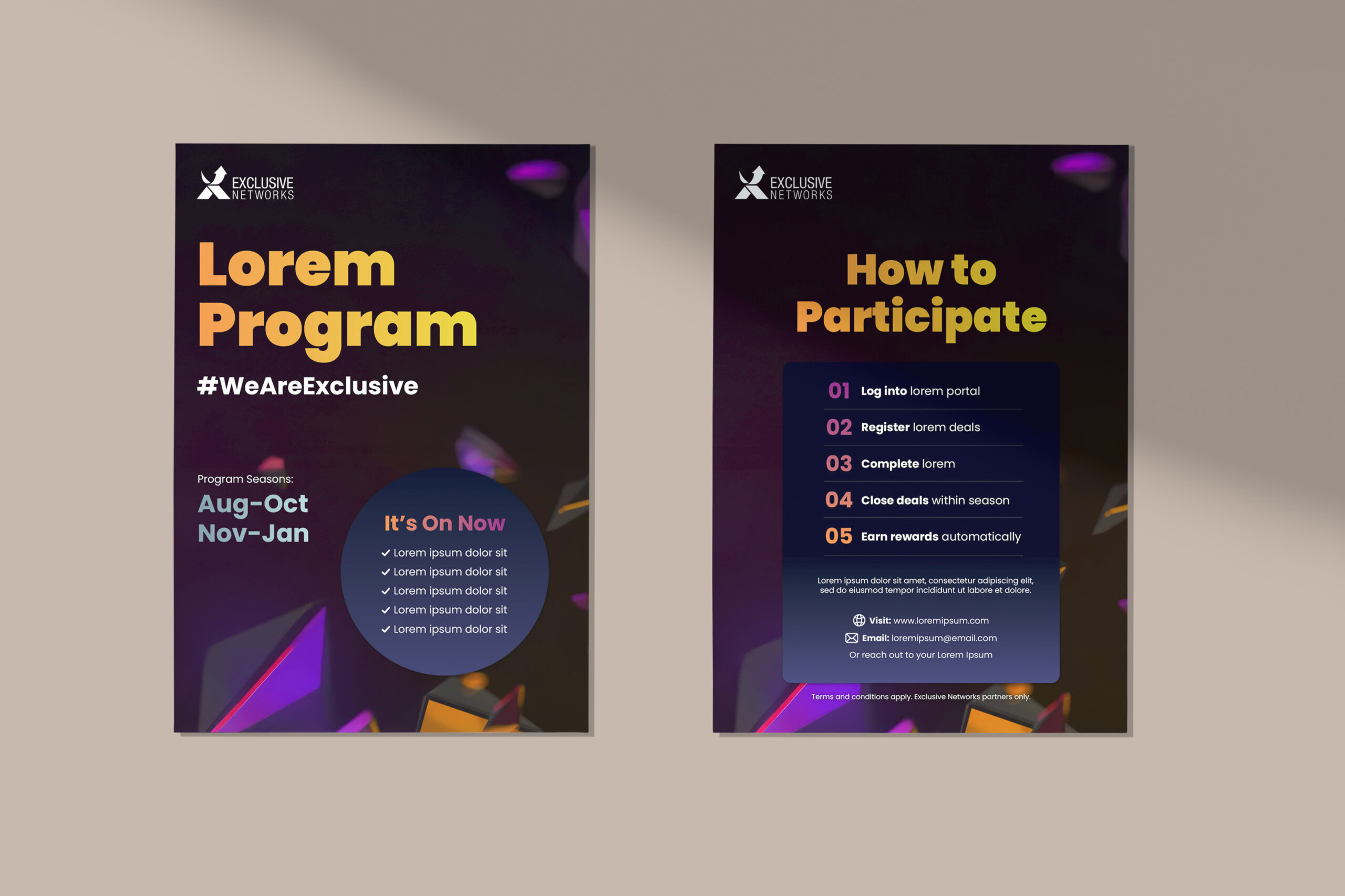
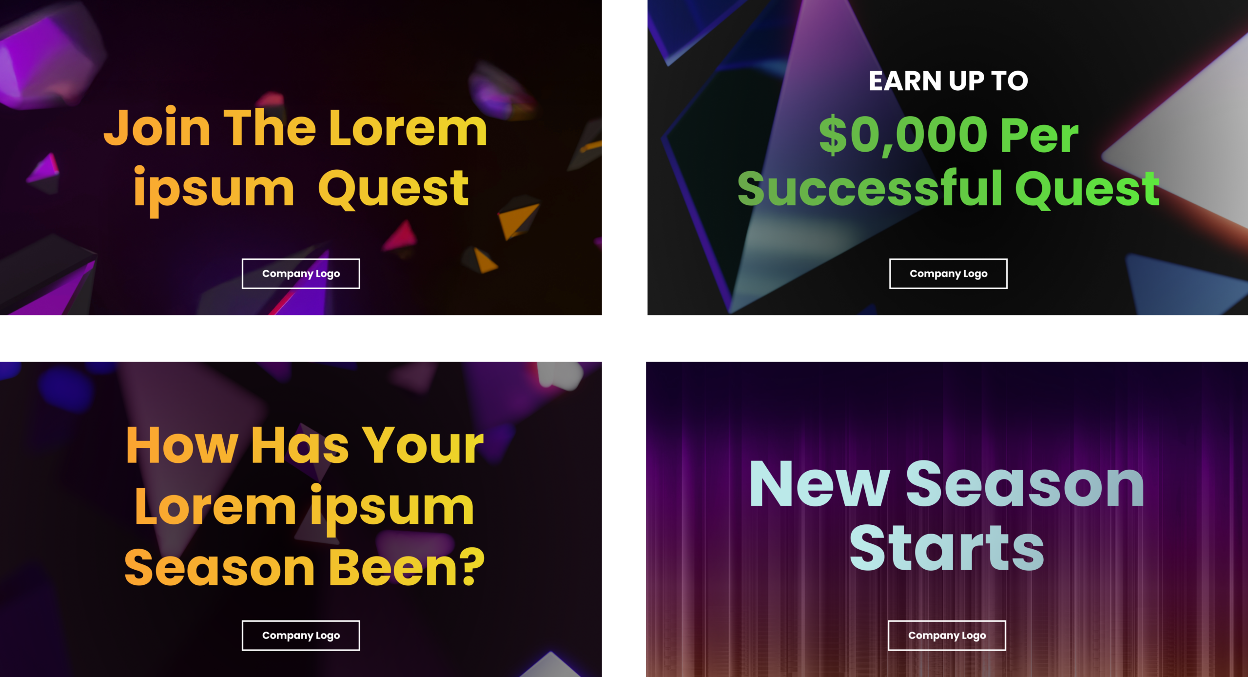
Flyers
The flyers distilled the campaign into a quick, high-impact format suitable for events or in-person distribution. I focused on bold visuals, minimal copy, and clear calls to action, ensuring the core concept and benefits could be understood within seconds while still feeling aligned with the wider campaign.
Social Media Assets
Social tiles for LinkedIn and Facebook were designed to capture attention quickly and communicate the campaign’s value within a fast-scrolling environment. I adapted the core visuals and gem motif into flexible layouts optimised for social, ensuring consistency across platforms while allowing for variation in messaging and emphasis.